
If you want your trading and investing to be better & profitable, than you should know these 8 best candlestick patterns. In this blog I will explain these candlestick patterns with simple example, so that even a beginner can understand it.
However, if you are not aware about the basics of candlesticks, and how to read them? I would request you to please check this How To Read Candlestick Charts?. It is a must read before you try to understand anything about the multiple candlestick patterns.
Just like math, until you know BOD-MAS, you can’t start solving algebra, differentiation and integration, so please read that first. That will clear all your basic doubts and confusion. However, if you are aware a little about the candlesticks you can continue reading.
Candlestick patterns are created by up & down movements in the price of a stock or index(e. nifty, bank-nifty). Like any other technical analysis indicator candlesticks are also based on “History repeat itself”.
Candlestick patterns has more information packed into it than the conventional bar or line chart. That is why Japanese candlesticks charts have been used far more than any other charts put together.
Candles could be single or multiple forming a certain pattern. Which helps you in indicating about the market mood and its direction. Learning candlestick does require patience but it’s worth giving the time and energy. At the end of the day its about your hard earned money.
Note: This guide will be long, as covering all aspects, please do read it with patience.
What Are Best candlestick patterns (multiple)?
There are lots of candlestick chart patterns, however it’s important to realize the best candlestick patterns are those who yield maximum benefit and trust-able enough. Just like single candlestick patterns, multiple candlestick patterns are separated into bullish and bearish.
Bullish patterns indicate that the price is likely to rise, while bearish patterns indicate that the price is likely to fall.
Multiple candlestick patterns are formed by two or more candles. Some of the best candlestick patterns are:
- Engulfing Pattern
(a) Bullish Engulfing Pattern (b) Bearish Engulfing Pattern - Harami Pattern
- (a) Bullish Harami (b) Bearish Harami
- Appearance of Doji
- Piercing Pattern
- Dark Cloud Cover
- Three White(advancing) Soldiers
- Three Black Crows
- Morning Star
- Evening Star
- Gap Up Opening
- Gap Down Opening
I have tried to mention all important points with best candlestick chart patterns example, so you do not need to go to google to search individually about them. Even if you cannot understand or find it little boring you can read this in succession.
Depending upon the time you have, but this will really going to benefit you while you make any trading or investing decisions.
If you are looking for the best stockbroker I would recommend you to checkout this broker, or you can directly use the below link to open the account free of cost.
Note: Candlestick patterns helps you to find the quick trend and direction. However, it is advisable to use candlestick pattern with other technical tool or indicators such as support and resistance.
What Is Engulfing Candlestick Pattern?
The word engulf means to swallow or immerse something. Likewise, engulfing patterns are like this. There are two types of engulfing pattern, bullish and bearish. Look at the image below to understand it better:


What do you understand after looking at them?
- The bearish engulfing candlestick pattern indicates, the green candle is completely engulfed or immersed in front of big red candle.
- Similarly, the bullish engulfing candlestick patterns shows the red candle is completely engulfed by the big green candle.
Usually, engulfing pattern needs 2 trading sessions to develop. In a classic engulfing pattern, you will find a small candle on day 1 and a comparatively long candle on day 2 which appears as if it engulfing the candle of day 1.
- If the engulfing pattern appears at the bottom of the trend, it is called the “Bullish Engulfing” pattern.
- If the engulfing pattern appears at the top end of the trend, it is called the “Bearish Engulfing” pattern.
- Only the real body of the first candle has to be engulfed not its shadows or wick.
- Shadows means the thin line that you see a the top and the bottom of the candles.
Now, that we know what is engulfing pattern let us learn how they appear on chart and what it implication one by one.
What Is Bullish Engulfing candlestick pattern?
The bullish engulfing pattern always appears at the bottom of the trend, it means that the sellers or bears have dragged the stock or index to the lowest level, however the price at those level creates demand among the buyers or bulls. They try to reverse the trend by making their position.
Bullish engulfing pattern is made by 2 candles first is red candle and the second candle which is engulfing it should be a green candle. Check the image below to see how does it appear on chart :

Above is ICICI BANK Ltd. (1hour) chart, after a heavy fall of we can see the emergence of bullish engulfing pattern, changing the trend. Moreover, within few hours one could have made the position by putting the stop-loss at the low of the second candle may have garnered quick money in intraday.
Let us see another chart of SBI Bank (day chart) for short term trading or investing.

This is a perfect example of bullish engulfing candlestick pattern. Keep in mind its a day chart one could have made the position for short term and within 1 week or 10 days, could have earned 70 Rs, per share.
One point is i want to make is it to avoid making position when the market is too volatile the candlestick may give you wrong signal.
Also, do not forget to put the stop-less as it will save you from high risk, as you are keeping your position all open. Try to use these patterns always with the other indicators and tools to be on the safer side.
If you are looking for the best stockbroker I would recommend you to checkout this broker, or you can directly use the below link to open the account free of cost.
What Is Bearish Engulfing candlestick pattern?
As we now know that bearish engulfing pattern appears at the top of the trend, which means the seller are trying to change the trend and drag the stock or index down. The first candles has to be green completely engulfed in front of large red candles.
All other points we have learned so far need to keep in mind while placing trade using the bearish engulfing patterns.
Let us see how it appears on chart:

Above, is SBI BANK (day) chart, after a big rally , the sellers have made a entry to the stock, they have tried hard to drag the position down, in which they were successful enough. As a day trader one could have easily short the position to gain the maximum benefit.
You can see in the chart there are other bearish engulfing pattern keep on emerging telling the sellers are very active and they will give up their positions so easily. One should never miss such amazing opportunities.
How to read Harami Candlestick Pattern?
No, it’s not what you are thinking the word harami means, the Harami (meaning “pregnant” in Japanese) is a trend reversal Candlestick Pattern. The pattern consists of two Candlesticks:
- Larger Bullish (green) or Bearish (red)Candle on Day 1
- Smaller Bullish(green) or Bearish (red) Candle on Day 2
Further there are two types of harami patterns
- Bullish Harami

- Bearish Harami

Let us understand each of them step by step.
What Is Bullish Harami Candlestick Pattern?
Similar to the engulfing pattern, bullish harami candlestick pattern appears evolves over a two day period. The bullish harami is a bullish pattern appearing at the bottom end of the chart. The prior trend should be bearish or downtrend.
Once the bullish harami patterns appear the reversal of the trend is expected. The shadow or wicks does not have to be constant with the first green candle but the body should be.
If you see, the first candle is big red bearish candle, which does not create any significance alone, however the moment the green candle comes, it shows the bulls have made an entry, and the next move of the bulls is to reverse the trend in their side.
The sellers will start covering their position opened in market, some may still try to drag the price down, but with the bulls entry there hard-work goes futile. A small green candle emerge signaling the trend has reversed.
Therefore, one should look for buying opportunity. Let us see how this appears on chart.

Above is Bandhan Bank Ltd. (1 day chart), after a steep fall in the prices, the bulls have tried to enter at 430 levels reversing the trend completely and within 2 trading session the price reached to 504, a sharp 70 rupees moves could have garnered you 7000 rupees if have bought only 100 shares.
However, as said keep a stop-loss(at low of first candle), whenever you are trading and look for other indicators too.
![]()
If you are looking for the best stockbroker I would recommend you to checkout this broker, or you can directly use the below link to open the account free of cost.
What Is Bearish Harami Candlestick Pattern?
The bearish harami is a bearish pattern appearing at the top of the chart. The prior trend should be bullish or uptrend. The first candle should be green showing the absolute control of buyers, however with the bears making entry, the trend has reversed.
One should look for selling opportunities when seeing bearish harami patterns over chart.
A bearish Harami evolves when there is a large bullish green candle on Day 1 followed by a smaller bearish red candle on Day 2. The stop loss for the trade would be the highest high between both the candles.
Let use see how to identify the bearish harami pattern and its implication on trends.
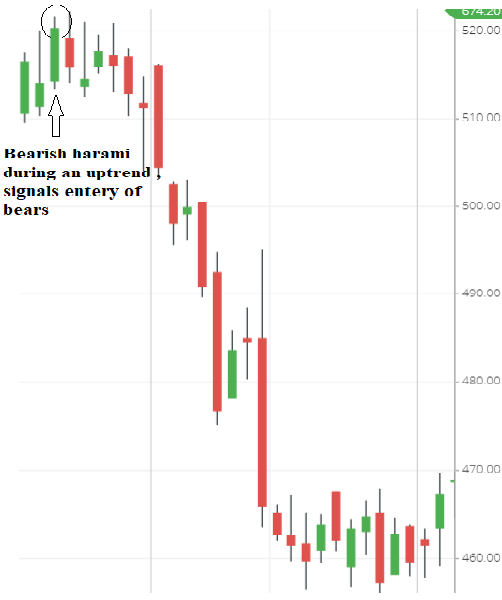
Above is Infosys(1 day) chart, the bull were enjoying the rally, however at the top of the trend, entry of bears made bulls fearful.
They tried hard to continue the trend but bears left no option 7 were successful in dragging the stock. A movement from Rs.522 to 451, within couple of session.
Always look for selling opportunity during bearish harami patterns with a stop-loss(high of the green candle).
Appearance of Doji in combination with other candlestick patterns:

Doji’s is one of the best candlestick patterns reflecting, confusion, indecision, hesitancy or uncertainty in the market. The body of the candles is very small with little or big shadows, sometime there will be no real body at all.
Whenever you see doji candle appearing on chart be alert that a trend can end or it may continue. Doji’ candlestick patterns show a pause in the current trend.
The appearance of doji usually happens with combination of other candlesticks pattern. It can be engulfing patterns or harami or may be any other.
The color of the candles does not matter but, green is sign of reversal in case of downtrend rally. Where as red shows the bears trying to drag a upward rally.
If you want to develop a comprehensive view on the market be it a stock or index always use the patterns in combination. Let us see how doji shows up on chart and what follows next.

Above is Nifty (1hour) chart, first will see doji as candle in alone, during a uptrend rally, when bulls were in total control of the market, suddenly at those level appearance of Doji (in red)shows sign of pause in the rally.
Which means bears have made an entry now and they are adamant to drag the nifty below, later they have successfully done so.
Whereas, at the bottom of the trend you can see a doji (green in color), showing the strong support from the bull and reversal is about to happen.
Let us see the doji now in the combination with other patterns:

Above is (1day) Sensex chart, doji appearing at the uptrend with a giant bearish marubozu candle is deadly combination of trend reversal. Within few trading session Sensex lost more than 2500 points. You can read here more about marubozu here.
Bearish marubozu occurs due to high selling pressure from the participants. One can short the positions while seeing this kind of pattern appearing.
What Is Piercing Candlestick Pattern?

Piercing patterns are similar to bullish engulfing patterns. As we have learned above in a bullish engulfing pattern the green candle(2nd) engulfs red candle (1st) completely. Whereas in a piercing pattern green candle(2nd) partially engulfs red candle (1st) real body.
Moreover the engulfing should be between 50% and less than 100%. As you can see the green second candle is engulfing the red candle more than 50%. This indicates that selling pressure is reducing with more buying.
This is a bottom reversal pattern with two candlesticks. A red candlestick appears on the first day while a downtrend is in progress.
The second day opens gap down at a new low but manages to closes more than halfway into the prior candlesticks red body, leading to the formation of a strong green candlestick.
The market is currently in a downtrend. The first red body reinforces this view. The next day the market opens gap down, showing that the bearishness still persists. After this very bearish open, bulls take charge.
The market surges toward the end of the session, resulting in a close way above the previous day’s close. A sense of fear develops among the short sellers who consider covering their position resulting in a further surge in prices.
Look for piercing pattern at the bottom of the downtrend, so prior trend should be down. Let us see how it appears on chart.

Above is HDFC BANK Ltd. (1day) chart, after a fall, the price were dragged to a level, where bulls have shown power to reverse this position.
With the appearance of piercing pattern during the downtrend shows, the bears are selling the shares at those levels. With the green candle, the bulls have finally been able to stop the fall and change the trend.
Never forget to put the stop-loss, the stop loss level is defined as the lowest point of the candlestick pattern formation.
If you are looking for the best stockbroker I would recommend you to checkout this broker, or you can directly use the below link to open the account free of cost.
What Is Dark Cloud Cover Candlestick Pattern?

The dark cloud cover is a bearish reversal candlestick pattern. Dark cloud cover is opposite of a piercing pattern. It is very much similar to the bearish engulfing pattern with a little variation.
As we know now in a bearish engulfing pattern the red candle (2nd) engulfs green candle(Ist) completely.
However in a dark cloud cover, the red candle on (2nd) engulfs about 50% or less than 100% of green candle(1st) real body.
Dark Cloud Cover Candlestick Pattern occurs at the top of a trend. The prior trend should be bullish. The pattern emerges by green candle followed by a red candle. This pattern is formed by the two consecutive candlesticks.
The trade set up is exactly the same as the bearish engulfing pattern. The high point of the candlestick pattern formation is considered as the stop loss level.
Let us look how dark cover appears on char and what happens next.

Above is TCS (1day) chart, as you can see at the top of the trend, dark cloud patterns appears, indicating the entry of bears. At this levels the bulls decide to close their position because of fear.
Looking at the correction in price short sellers consider to take fresh positions resulting in a reversal in trend.
What Is Three White (Advancing) Soldiers Candlestick Pattern?

Three white soldiers, also refer as three advancing soldiers is a bullish reversal candlestick pattern. This pattern appears after a downtrend and indicates about the bulls making entry.
It is formed when three long bullish candles (green) appears after a downtrend consecutively.
First candle should be a bullish green candle with long real body followed by the second candlestick, which should be bigger than the previous candle’s body & the last candlestick should be at least the same size as the second candle and have a small or no shadow at all.
The opening of each candle is slightly lower than previous close and prices progressively close at higher levels.
As an trader you should be looking for buying opportunities on seeing three advancing soldier candlestick pattern on chart. Another point I want to make is, sometime you might see it evolving during the middle of an uptrend as well.
Do not forget to put stop-loss at the lowest point of the candlestick pattern formation.(i.e. first candle low). Also, you have to be flexible with candlestick patterns.
Don’t look for exact patterns, Nothing is perfect so, its ok , if candles patterns are slight different like length(range) or shadow. However, the overall pattern do look similar.
Let us see how it appears on chart:

Above is IRCTC(1 hour chart). Oh, this must have been great opportunity. As you can see, the share jumped from level of around 1000 to 1500, within couple of trading session. And, there are not one but 3 white soldier candlestick patterns.
If you are looking for the best stockbroker I would recommend you to checkout this broker, or you can directly use the below link to open the account free of cost.
What Is Three Black Crows Candlestick Pattern?

Opposite of three white soldier is three black crows candlestick pattern. Three black crows is a bearish candlestick pattern that indicate the reversal of an uptrend.
The black crow pattern consists of three consecutive long-bodied bearish (red) candlesticks. It opens up within the real body of the previous candle and closes lower than the previous candle.
This pattern appears at the top of the trend and inform us that the price can go further lower. One should look for selling opportunities at these levels.
The high point of the candlestick pattern formation is considered as the stop loss level(first red candle).
Let us see how it appears on chart:

Above is BRITANNIA(1day) chart. After the stronghold of bulls, there is a sudden surge in downfall, due to entry of bears in the market, which dragging the stock to down levels.
This is a sharp move of more than 400 points within couple of trading sessions. One should look for shorting when seeing the three black crow at the top of the trend.
What Is Morning Star Candlestick Pattern?

Morning star candlestick pattern is a bullish reversal pattern, it means the prior trend should be down, showing the strength of bears in the market. The pattern includes three consecutive candlesticks:
- First is large Bearish (red) Candle indicating dominance of bears.
- Second is small Bullish (green) or Bearish (red) Candle, preferably a doji or a spinning top, showing the uncertainty in the trend.
- Third is large Bullish (green) Candle informing the bulls have reversed the trend and the downtrend is ended.
Look for buying opportunity when you see the morning star, which is also known as Bullish Morning Doji Star. The stop loss level is defined as the lowest point of the candlestick pattern formation, which in most of the cases is the second candle low.
Let us see how morning star candlestick pattern appears on charts:

Above is BRITANNIA(day) chart, as you can see the bullish morning star pattern appears at the bottom of the downtrend. Within couple of trading session it lead to cross levels from 2600 to above 3000.
These are the power of learning the best candlestick patterns and use them in your daily trades.
What Is Evening Star Candlestick Pattern?

Opposite to the morning star candlestick pattern, evening star is a bearish candlestick reversal pattern, telling us that bulls are losing the control.
Evening star appears at the top of the trend, it signals the uptrend is about to get paused and a fresh downtrend can begin anytime soon.
One should look for the shorting opportunities, if the evening star appears during an uptrend. Evening star is also known as “Bearish Shooting Star”.
- First candle is green, showing the presence of bulls and continuity in uptrend .
- Second candle is either a doji, spinning top or can be inverted hammer showing the indecision and selling pressure from the bears.
- The third candle is red bearish candles, showing the supremacy of bulls have come to an end, and the trend has reversed completely now.
The high point of the candlestick pattern formation is considered as the stop loss level(the second candle). Le us see how does it look on a chart:

Above is ICICI BANK Ltd.(1 hour) chart, after a sharp rally, it reached to a level where bears have made the entry. However the first attempt resulted in a doji pattern and in the next candle, bears were successful and bulls started selling their position.
Finally, the bears have taken the control of the situation and have dragged the shares down within couple of hours.
Last but not the least we’ll be learning about the gap up and gap down opening, what is its significance on chart and market.
If you are looking for the best stockbroker I would recommend you to checkout this broker, or you can directly use the below link to open the account free of cost.
What is Gap Up Opening?
In simple words, when a stock or a index open high than the previous day’s close. As an example suppose a stock closed at Rs.200 on Friday at the end of the market session. However, on Monday it opens up directly at 205. This will be called gap up opening.
Usually a stock or a index opens up with gap due to some good news related to them or the overall market.
Look at the chart below to see how it looks:

Can you see in the above chart the stock gaped up and you can’t see any candle linking them. This happens if the stock has given its best quarterly results or they might have set up a new manufacturing unit or the sales have gone up significantly.
The same thing can happen with the index, Suppose the growth in the GDP data, will create a happiness among the market and the buyers will buy the index or stock at any price point.
Check another chart below showing the same.

What is Gap Down Opening?
Similar but opposite to the gap up is gap down opening. When there is some bad news related to market or a stock, the price start falling and sellers are ready to sell that at every price point.
So if a stock closed at Rs.100 on Monday, but after the market gets closed the result were announced for the company and it was not up to the mark.
Next day the buyers want to get rid of the stock, this will create panic and the seller will be ready to short the stock at every price point. Gap down opening shows the bearish sentiment in market.
Look at the chart below to see how does gap down opening looks like:

![]()
Conclusion:
So, at last these were my best candlestick patterns, which I have used personally in my trades. I hope you might have like it too.
Apart from these, I would be very honest and blunt, to tell you few things which you need to keep in mind while using these patterns:
- Never ever go alone with the candlestick patterns always use other technical indicators and tools.
- Never ever try them in highly volatile market, because the market will make very unorthodox high and low creating false patterns.
- Always use the pattern in combination, and keep a strict stop-loss, and exit the trade as soon as it hits.
- Always check the prior trend while following any trend reversal candlestick patterns.
- Avoid taking position with small candlestick patterns or when there is low participants(volume) as it’s not worth giving the effort.
- If possible look for the confirmation from the second or third candle before taking the position.
- Once the trade has been placed, do not try to correct it, the market does move opposite to your trade and it happens with each and every one of us. You have to stick to some strategy at the end of the day.
Apart from using candlestick pattern one should also know about the support and resistance levels plus the best moving averages for day trading.
If you are looking for the best stockbroker I would recommend you to checkout this broker, or you can directly use the below link to open the account free of cost.
In case you want to know how much you need to save every month to reach your financial goals check out Moneycontain Monthly SIP Calculator with inflation here.
Do you know the concept of present value of your future money, if not then you should.
Just like 100 rupees in your pocket today will not have value of 100 rupees after 5 years, similarly 100 rupees you receive in future, invested today won’t have the same value. Confused??
Check moneycontain present value calculator and ultimate guide on NPV here.
If, you have liked the content please do share it with your friends or on social media, as sharing do bring the good karma. If you have any questions or feedback you can leave them in comment box below.
Note: Please do not take this as any recommendation, to trade or invest. This is just for reference, to make you understand more about candlestick patterns and its importance, under no circumstances intended to be used or considered as financial or investment advice, a recommendation or an offer to sell, or a solicitation of any offer to buy any securities or other form of financial asset.
Please do your own research and make investment. Moneycontain will not be responsible for any of your losses at all. The point made is for educational purpose only. All investments are subject to risks, which should be considered prior to making any investments.

![Read more about the article Best Option Strategy for Bank Nifty & Nifty 50 in 2026 [Complete Guide]](https://moneycontain.com/wp-content/uploads/2025/09/best-option-300x201.jpg)
